31.8 Single Outcome Sensitivity Analysis
If your model has just a single outcome for analysis - for example Cost only or Effectiveness only - the outputs of Sensitivity Analysis look different. This section will cover:
-
Performing one-way sensitivity analysis on a Single Outcome model
-
Sensitivity analysis thresholds on a Single Outcome model
-
Correlations
This section will use the Get Started example model, Three Vars.trex, which has a single payoff of cost.
Performing one-way sensitivity analysis
-
Open the Get Started Tutorial example tree "Three Vars".
-
Select the decision node.
-
Choose Analysis > Sensitivity Analysis > 1 Way..., or click the toolbar icon for 1-way sensitivity analysis.
-
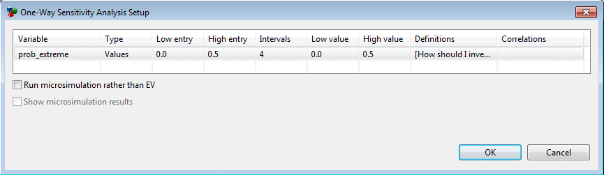
In the Sensitivity Analysis dialog, click on the Variable column to see a drop downlist and select the variable prob_extreme.
-
Press enter or click OK to run the analysis.
If you specified a low and high value in the variable’s properties, that range will be shown. Otherwise, the range will be set using default values (0 to baseline value). In this example, the saved range is 0 to 0.5.
The check boxes related to Microsimulation allow you to run a set of trials through the model for each value within the variable range. You will receive a warning if the variable you have selected for Sensitivity Analysis is not a variable defined at the root node, as a number or as a distribution.
In the section Running One-Way Sensitivity Analysis on CE models you can find details about how to set the range you need for the parameter you are doing sensitivity analysis on.
Once you have selected OK, TreeAge Pro should immediately begin the analysis. If the analysis were a long one, you could monitor its progress in the status bar at the bottom of the TreeAge Pro window. When it is complete, a dashboard is displayed.
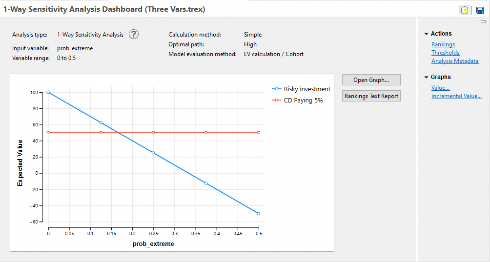
Because the analysis was done at the decision node, there should be two lines corresponding to the two alternatives, Risky investment and CD paying 5%. Each alternative’s expected value is plotted as a function of the increasing value of prob_extreme.
Each strategy’s line is composed of line segments connecting the line marker symbols that identify that alternative’s expected value at successive intervals of the analysis. A legend to the right identifies the symbol assigned to each particular alternative.
Deviations of a line from the horizontal indicate that strategy’s sensitivity to the variable. An alternative represented by a horizontal line in the graph, such as the "CD paying 5%" option in the example, is unaffected by the changes in the variable. In contrast, the payoff represented by the "Risky investment" line is a decreasing function of the variable.
The analysis text report, showing the underlying calculated values, can be opened by clicking the Rankings Text Report link to the right of the graph as shown below.
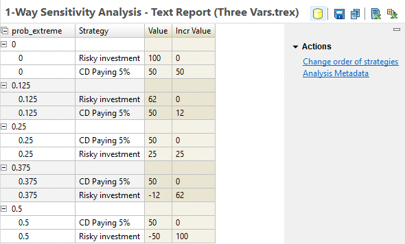
This text report essentially mirrors the output from the Rankings text report, except with a separate group showing separate results for each variable value specified by the sensitivity analysis range/intervals. The strategies are sorted within each grouping based on the value (lowest to highest) by default. With this presentation, the incremental value can be used to determine the optimal strategy. However, you can also choose to override the default sort via the option "Change order of strategies" to the right of the report.
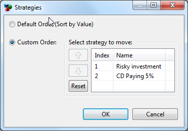
With this option you can choose the strategy order you want. The same order will be applied to all values of the parameter.The text report can be exported to Excel using the "Open in New Excel Spreadsheet" icon to the far right of the report toolbar. There are two export options - one showing each strategy in its own row and one showing all strategies in the same row.
Sensitivity analysis thresholds on a Single Outcome model
The graphical sensitivity analysis results can be interpreted to understand thresholds of the model. If two lines in the graph intersect, at the corresponding value of the variable these two strategies have the same expected value. Crossing points that represent a change in the optimal strategy are called thresholds. From the standpoint of expected value, the decision maker should be indifferent between the two options at a variable’s threshold value.
Threshold lines
In this example, the threshold is when prob_extreme = 0.17. For values higher than that, including the baseline 0.3 probability, the CD strategy has a higher return and is therefore optimal. For values of prob_extreme less than 0.17, Risky investment is optimal.
In this analysis, the threshold is not close to our two best estimates, 0.25 and 0.3, so perhaps the model is not sensitive to this particular uncertainty.
Among other options for formatting graphs, you could change the numeric formatting of the x-axis to calculate the threshold to a greater degree of accuracy.
Thresholds Report
You can also pull threshold information from the analysis by clicking on the "Thresholds" link to the right of the Sensitivity Analysis output graph. This report focuses on the variable value and strategies associated with each threshold in the analysis. See below.

Note that the report shows the variable, its threshold values, the strategies that are equivalent at the threshold and the EV value for the strategies at that threshold.
If all of the lines in a sensitivity analysis graph are straight, the threshold analysis in the graph will be exact. However, if any lines appear curved, the threshold analysis is a linear approximation, and its accuracy will increase as the width of the intervals decreases.
The analysis performs calculations only at the ends of the N number of intervals specified when running the analysis. The lines plotted on the graph are accurate at these N+1 discrete points, but not necessarily in between (e.g., if an alternative’s expected value is an exponential or other non-linear function of the variable’s value).
The sensitivity analysis graph will not recognize a threshold if the optimal strategy is the same at both ends of the interval, but changes back and forth within the interval. The likelihood of this error can be reduced by increasing the number of intervals, thus reducing their width.
A more sophisticated, non-graphical form of threshold analysis is described in the More Sensitivity Analysis Tools Chapter. This chapter also includes more information on one one-way sensitivity analysis and other kinds of sensitivity analysis.