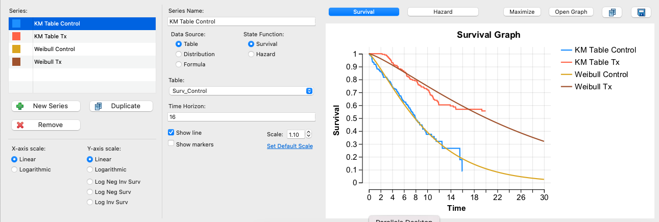
14.4 Hazard Proportionality Graph
This graph displays 2 or more tables (and optionally distributions) in a log-based graph to show whether the hazards related to these elements are proportional. When hazards are proportional, it is valid to apply hazard ratios to calculate one event's risk based on the other. For example, there could be a treatment effect that reduces hazard related to a health event.
We will use Healthcare Example Model PropHazard.trex to illustrate how to run this report.
-
Open the example model.
-
Open the Tables View.
-
Select the first table.
-
Hold down the Control (Windows) or Command (Mac) key and select the second table.
-
Click the Hazard Proportionality Graph icon in the Tables View toolbar.
A dialog will open to allow you to add/change the tables and possibly distributions you wish to include in the graph. Check both distributions.
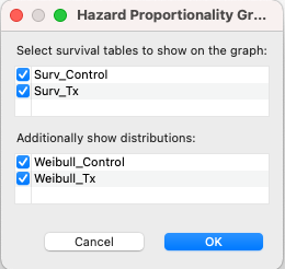
Click OK to generate the graph.
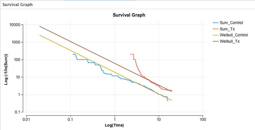
Note that the graph shows declines in survival from the tables and distributions on log scales for both survival and time. This log/log presentation demonstrates proportional hazard as parallel lines. The two Weibull distributions have the same shape, so they are perfectly proportional as seen in the parallel lines above. The two survival tables are close to parallel as you move towards the end of the data, so they are "nearly proportional".
The same graph can be created in the Survival Plot as shown below.
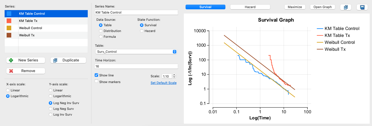
Note that without the log scales, it is not possible to visualize the proportionality of hazard.